Because I think it’s important not just to show pictures of designed objects but rather to give them some context; because such comments as do exist regarding some of the work shown here are long, old, and buried deep my blog; and because this site is likely to disappear soon anyway if the job market in my husband’s field doesn’t improve, I adduce here some off-
the-
cuff remarks about the work you see above.
The Gospel according to Mark
A response to the ‘Reader’s Bible’ trend much discussed ( even spearheaded ) by the writer of the Bible Design Blog some several years back as well as to my realization of my own ignorance of the narrative, rhetorical, or other structures of the Scriptures ( and to the utter shittiness of almost all English-
language Bibles on the market today ). It features, among other things, a four-
level outline provided in full in a multi-
page table of contents, then displayed incrementally spread by spread as expanded running heads. Printed in an edition of, I think, five copies, with a handmade cover that I swear I didn’t copy consciously from the Counter Press’s ‘A tale of the black stuff ’. Today I would omit the fleuron and would duplicate the continued chapter numbers ( and the bold type of the new chapter numbers ) of the running heads in the text below ( why did I not? ), but otherwise I stand by the design and wish I could produce and own a set of these covering the whole of Scripture – preferably in a better translation, if a suitable one were available in the public domain.
Five Centuries: The Wends and the Reformation
A new English translation of a study of the impact of the Reformation upon and among the Sorbian people. The full article linked to above contains a good account of the work, the thought behind it, and some regrets. It does not mention the fact that the printers ran the paper grain the wrong way: a disaster partly mitigated by their use of unaccountably heavy stock. The work I undertook on both translation and typography to bring this important cultural document to press remains among the more intellectually and creatively fulfilling and energizing things I have done.
with heart & soul & voice
A several-
times-
redesigned piece introducing a year-
long parish program, the closest thing to a magazine I’ve had the chance to design since high-
school days. Long live the grid!
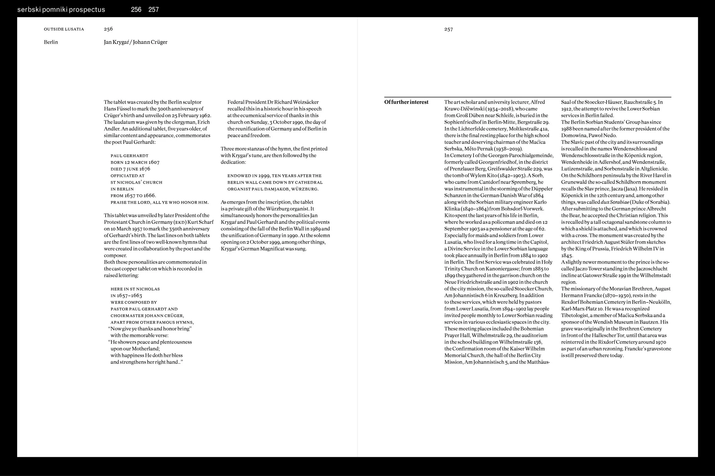
Serbski pomniki
Another English translation of a Sorbian cultural document: an ever-
expanding catalogue of monuments relating to Sorbian persons, institutions, and the like, the relentless pursuit of which by its author, in the face of what I gather to be ongoing language and cultural erosion, I find quite moving. A rather tortuous translation process and an evolving idea of its intended use case(s) and format led ultimately to a desire on the publisher’s part simply to copy the matching original Sorbian and German editions ( 17 × 24 cm [ 6.625 × 9.5 in ], hardcover, set run-
on in two justified, and therefore poorly spaced, columns of The Sans; headings in blue, bibliographies in grey; images only 1 column wide ), and thus my disinterest in and concomitant departure from the typographical work desired. Pictured here is one state of the evolving design, showing most of the different kinds of elements involved, including a substantial organizational ( geographical ) hierarchy, specific location information, captions, transcription/
translations of inscriptions, cross-
references, sidebars, and proper names in both Sorbian and German forms. As with
Five Centuries, I intended to open the page up considerably from the rather locked-
in German original, though as a catalog this was to have had a different kind of page structure from
Five Centuries, and I don’t think the quirky and rather literary Quadraat would have suited either the page structure or the purely informational nature of the text: hence this trial use of the unpretentious and surprisingly very good Concorde. I’m sorry, in the end, not to have had a hand in this important documentary work.
Goostly psalmes and spirituall songes
As described at some length in the linked article, this crucial though stalled project had a long gestation which chronicled ( and, really, constituted ) a major shift in my approach to typography and threw me, to my surprise, into doing some serious amateur musicology. It began, as I said, as a portfolio project to play with a certain typographical problem: the display of certain bibliographical apparatus. Typographically speaking, it became an exercise in balancing familiarity and unfamiliarity; that is, in some way acknowledging and mirroring the fact that the text and its original presentation were perfectly ordinary in their day ( and so should not be unthinkingly exoticized ) but are in fact quite distant from our cultural location ( and so should not be unthinkingly normalized ), as well as in accommodating new, additional, scholarly apparatus. The typographical task eventually gave way to very significant editorial work on what turned out to be a quite flawed text: collation of as many versions of the songs in the book as I could find in collections contemporary with it; production of complete syllable underlay charts; research into Early Modern English pronunciation and prosody and English musical sources contemporary with this one; etc. The possibility of ever finishing it seems to diminish with time, and would probably call for some revisions to the design as well as to the editorial approach.
fauré requiem
Or,
drei quadraten auf abenteuer (
hommage à kurt hauert )? Gratuitous fun with the deliciously terrible Folio Medium, as well as a chance to deploy Century Expanded, which I’ve had a bit of a thing for ever since it was used in some computer magazine I read as a kid.
chant booklets
The latest redesign of a series format ( of which see more on the Resources page ), the evolution of which is pretty indicative of my development as a typographer: from trying, essentially, to reproduce a manuscript with computerized typography, to an ordinary book face, one color, minimalist clefs, and some very careful work with type sizes, spacing, and positions, all meant to harmonize with a range of existing publications.
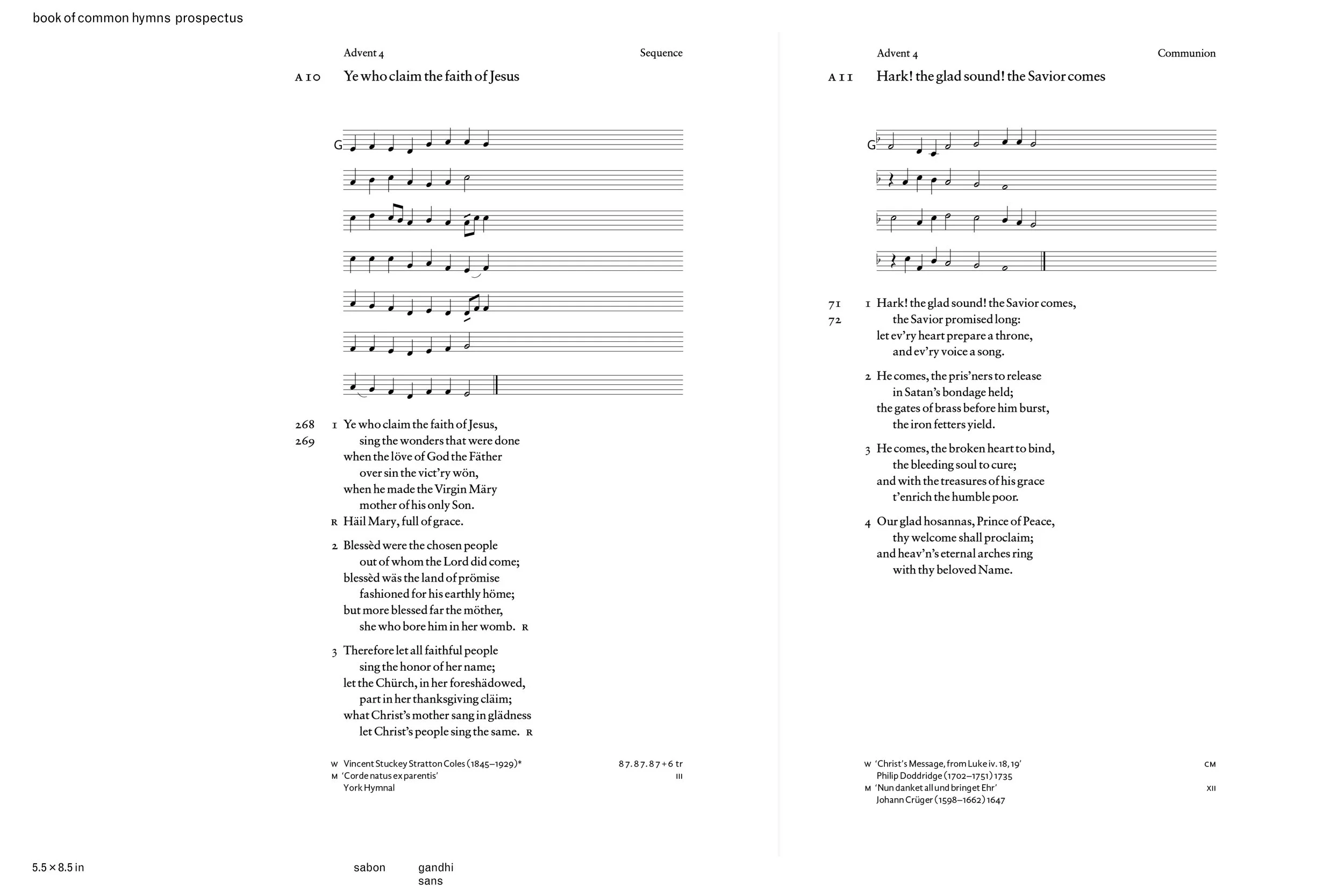
Book of Common Hymns
The sudden emergence of the need during the pandemic, and the lingering sense of obligation ever after, to livestream church services has highlighted a significant problem in the Episcopal Church ( cue the clutching of many pearls ): an officially appointed Hymnal many of whose contents cannot be freely reprinted or broadcast ( and some of which cannot be used in those ways at all, since their copyright holders or status are unclear or inaccessible ). People should certainly be able to live by their art, but if the Church cannot bring itself to act as patron to creators and provider to its members and licenses cannot accommodate the adaptation that is an ordinary and often necessary part of the practice of church music, I am inclined to sidestep the whole business and sing nothing that is under claim of copyright. This never-
to-
be-
finished project ( which has nevertheless borne fruit elsewhere ) sets a liturgically appropriate and liturgically appointed selection of public-
domain selections from the Hymnal to modal, monophonic tunes, i.e. chant from both the Church’s historic repertories and vernacular traditions stylistically in keeping with them. In the process it attempts to address the legal availability and liturgical suitability of; musico-
textual relationships within; and stylistic, metrical-
temporal, and notational relationships among the streams of, the Church’s hymnic repertory, though the it would need, at the least, much further study of relative tempi and the rationalization of note-
values along the lines of Jan van Biezen’s work ( can the contents of the shape-
note books, for example, ever have been sung at the tempi described in their prefaces? has anyone done work on the evolution of this prefatory material from, probably, Morley onwards, or on meter, key and pitch, and note-
values in these books? ). Possibly the whole thing should be yet smaller – I love the tiny thingness of European and British, and even the Hymnal 1940, melody-only editions – but I also like to have room on the page, and imagined this being printed off on letter-
size paper in seasonal fascicles.
The Book of Common Prayer 450 years
Sabon has been a semi-
official typeface of the Episcopal Church since the mid-
1970s, when Bradbury Thompson served as a typographical consultant for the Church’s Draft Proposed Book of Common Prayer. ( Thompson also used Sabon in the Washburn Bible, for which the face was adapted for phototype in 1972; in the Emerson, Hawthorne, and
Anthology of American Classics Westvaco books; and on many postage stamps.) The title treatment of the Prayer Book reproduced in this piece is especially characteristic of Thompson’s work; Sabon’s rather decent figures – displayed prominently to good effect in the 1979 Psalter – provide the other main element of this fictitious poster. Though all accounts I have seen of the design and production of Sabon stress that the main impetus for its commission was the desire for a face that would appear identical in foundry, Linotype, and Monotype versions, and at least one of these accounts also implies that all sizes were pantographically produced from the master drawings ( which do indeed look like the text version available today ), anyone can see that the original specimens – and Thompson’s works – show a display version that is more delicate than the text sizes and very much more refined than today’s digital versions. Sabon Next ain’t it.
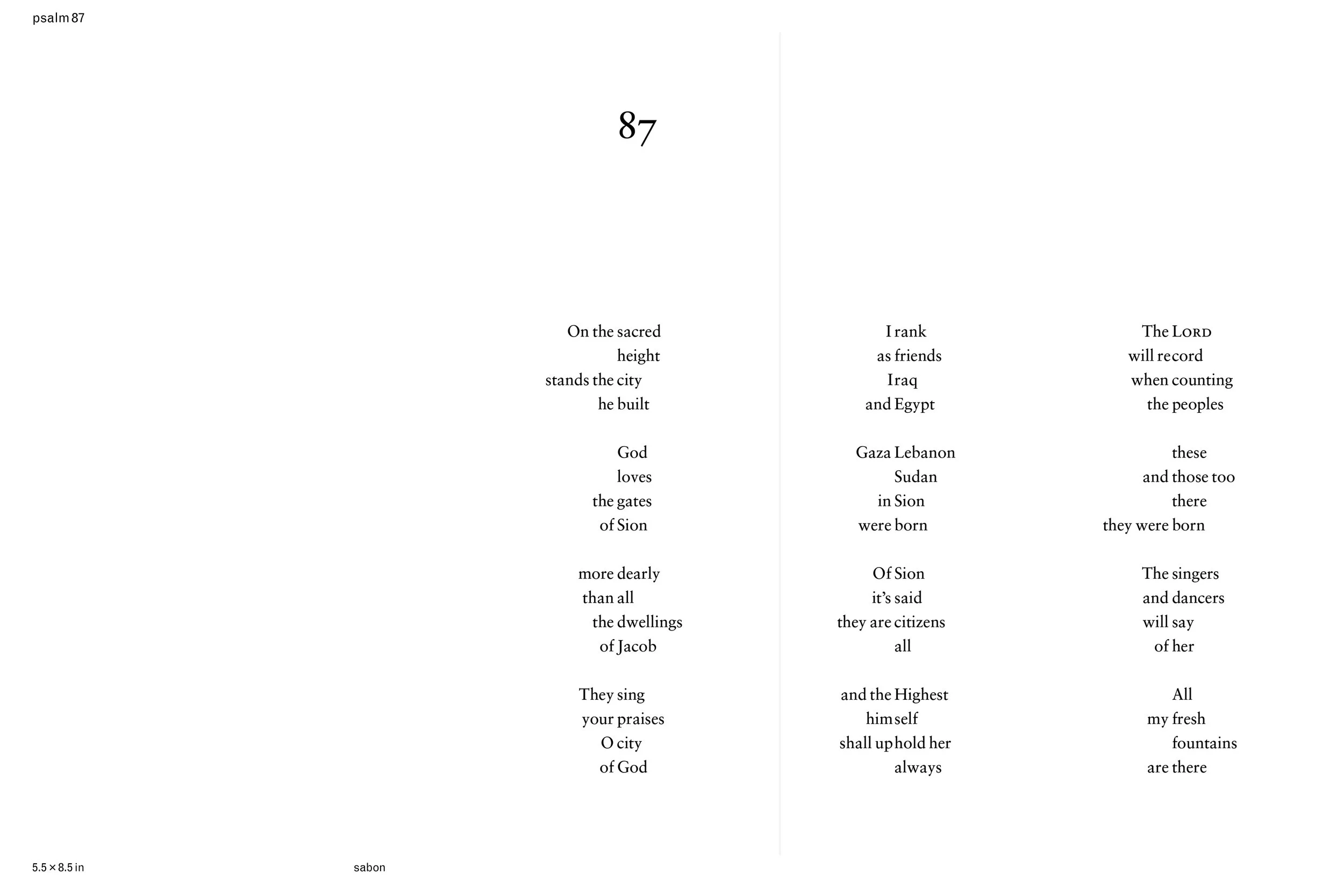
Psalm 87
In an alliterative stress-meter version which I fashioned from the 1979 Psalter text, in a typographical setting derived in part from that of certain items in John Cage’s
Silence ( an underappreciated and uncredited tour de force of typography, as well as of other things ), wherein the stressed syllables are vertically aligned. The import of the text should be clear enough for those with ears to hear.